Style × Layout: How baoyu-skills' Visual Design System Makes AI Draw Better Than You Can Design
- Smars
- Agent skill , AI Efficiency , Visual Design
- 09 May, 2026
You ask AI to draw a picture. It gives you oversaturated, plastic-looking junk. You ask AI to make an infographic. It piles text onto an opaque background. You ask AI to design slides. It delivers a multicolored, zero-consistency disaster.
The problem isn’t that AI can’t draw — Claude writes pixel-perfect SVG, DALL·E and Gemini generate photorealistic images. The problem is you told it to “go wild.”
The baoyu-skills visual design system was built to solve exactly this. It uses style × layout combinatorics to turn visual creation from “guess the prompt” into “pick the parameters.”
Not Teaching AI to Design — Giving AI Design Constraints
Most AI drawing tools follow a “give prompt → get image” workflow. The better the prompt, the better the result. But “better prompt” means you need to understand composition, color theory, style, and information hierarchy — in other words, you need to be a designer.
baoyu-skills flips this. Instead of letting AI run wild, it constrains the output through a structured parameter space:
- Style determines visual aesthetics (linework, color, texture)
- Layout determines information structure (density, hierarchy, relationships)
- Palette acts as an optional overlay for micro-adjustments without breaking the style
The result? You don’t need to know “what prompt produces flat vector style.” You just say style=notion, layout=dense, and the skill handles the rest.
This system spans five visual scenarios:
| Skill | Styles | Layouts | Design Space |
|---|---|---|---|
| XHS Image Cards | 12 | 6 | 72 combinations |
| Professional Infographics | 17 | 20 | 340 combinations |
| Slide Decks | 16 presets (4D) | 4 densities | 16 presets |
| Knowledge Comics | 5 art × 6 tone | 6 | 210 combinations |
| Article Covers | 6 type × 11 palette × 7 rendering | - | 77 combinations |
Over 700 visual solutions available in baoyu-skills. All you need to remember are two parameters.
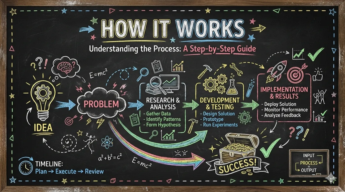
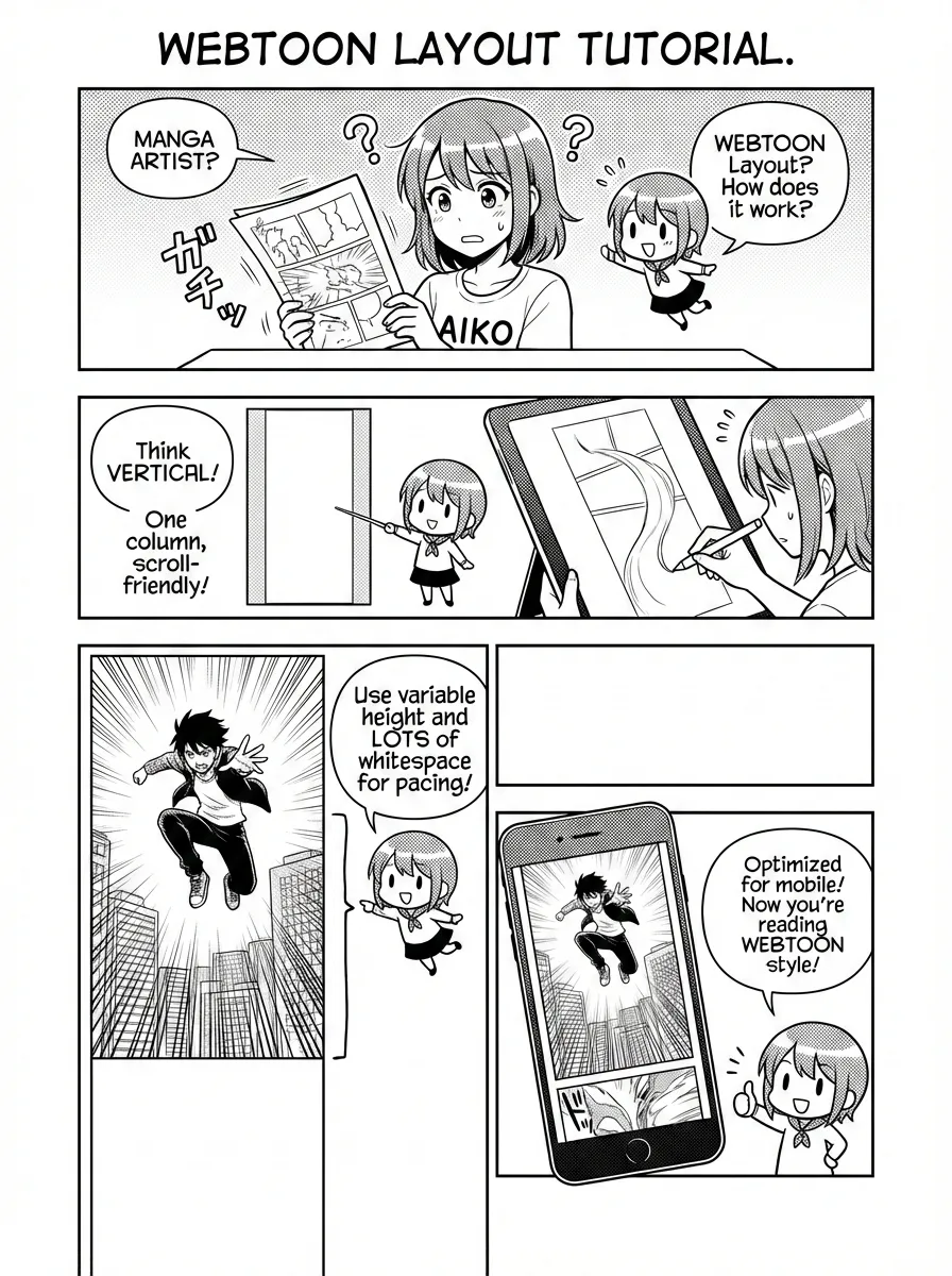
XHS Image Cards: Style as Language
Xiaohongshu (RED) content lives and dies by the visual tone of its image cards. baoyu-xhs-images automatically breaks an article into a sequence of 1-10 cards, each using a unified style with a variable layout.
12 Styles
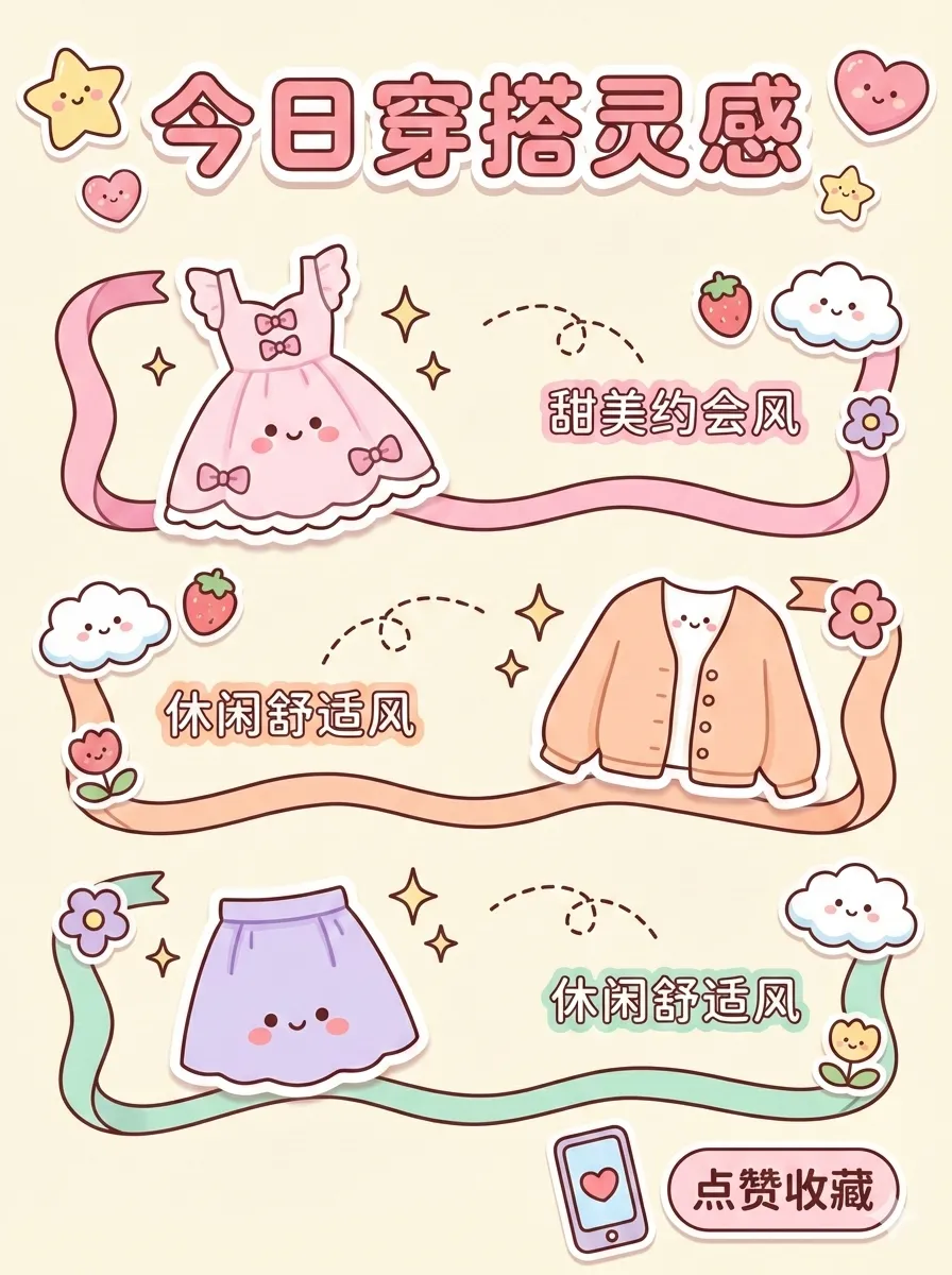
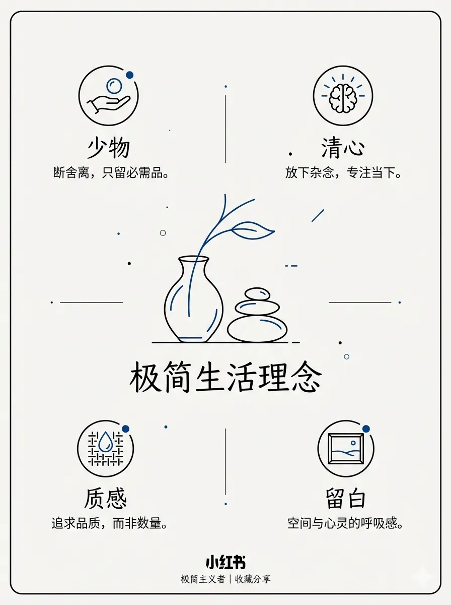
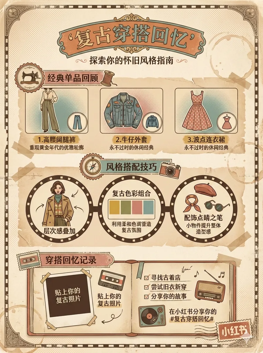
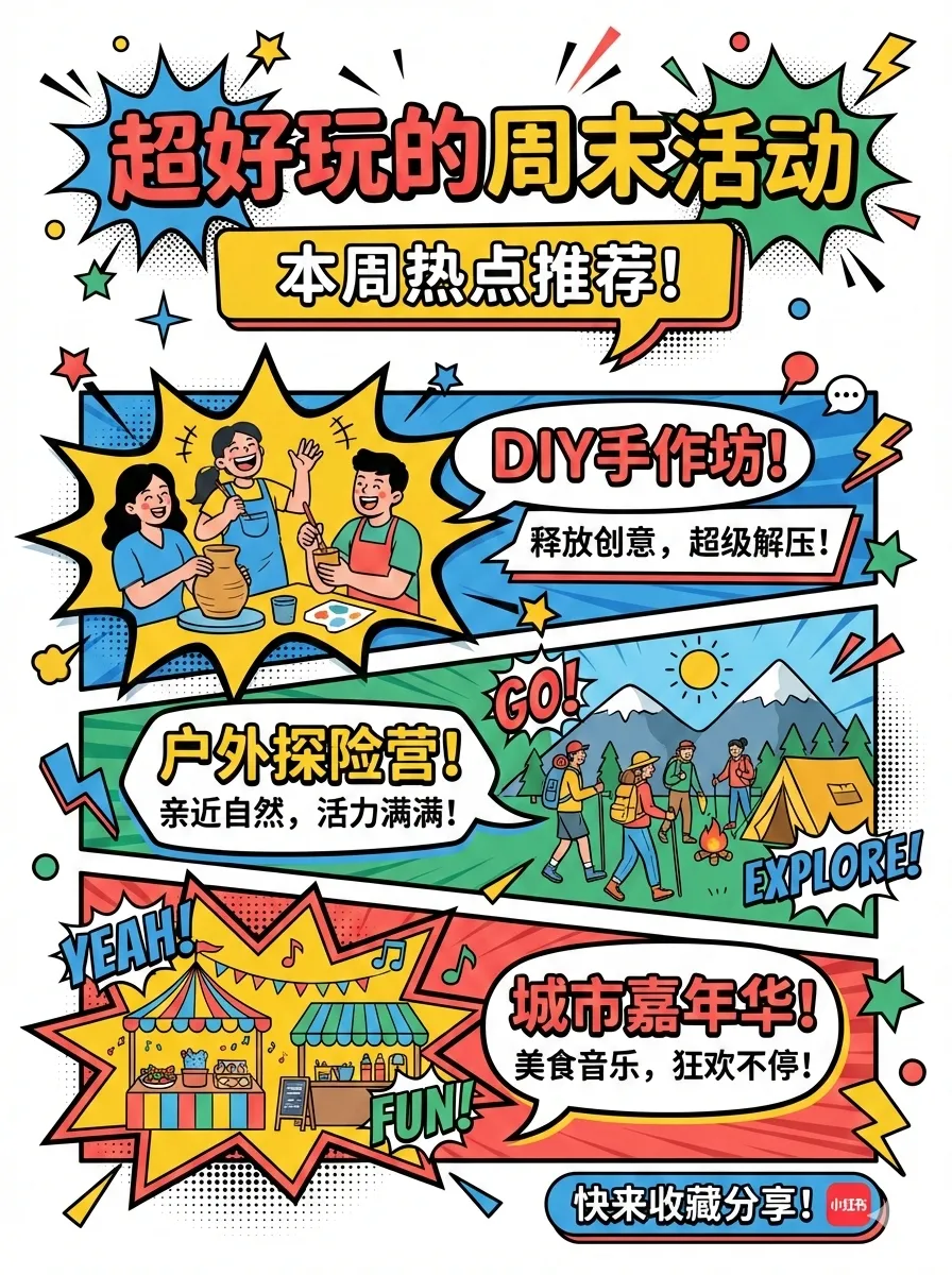
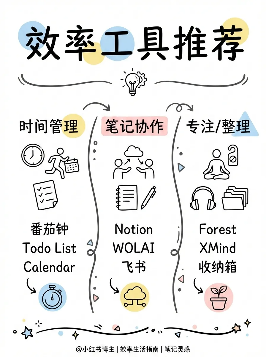
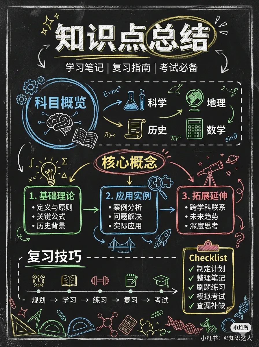

From cute (cartoon-kawaii) to notion (minimalist hand-drawn) to chalkboard, each style isn’t just “a different filter” — it redefines linework, typography, and decorative elements. The gap between minimal and bold isn’t just font weight — one is restrained elegance, the other is direct impact. Pop and retro occupy entirely different cultural registers.
6 Layouts
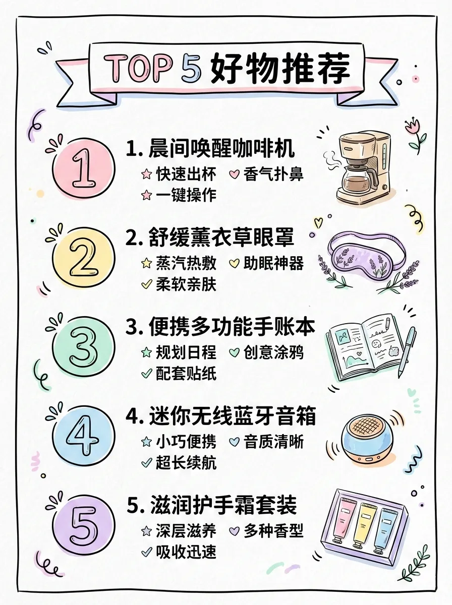
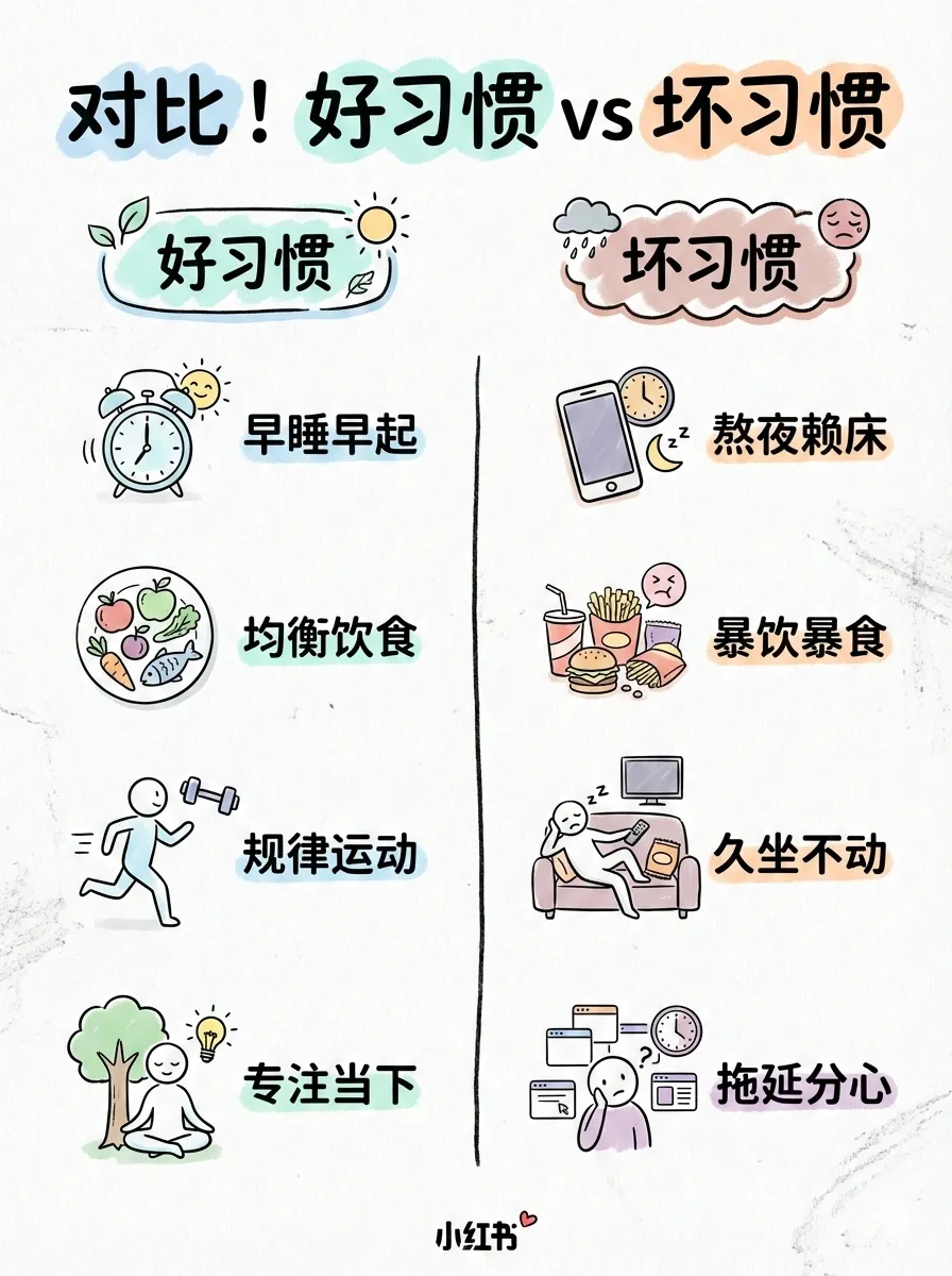
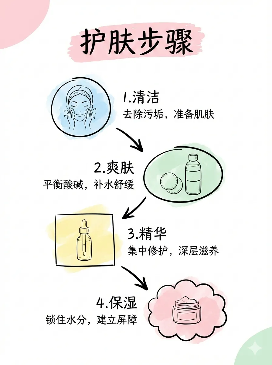
Layout determines information density and presentation mode. sparse works for covers and one-liners (1-2 points), dense for knowledge dumps (5-8 points), comparison for side-by-side evaluation, flow for step-by-step timelines. Same content, different layout — completely different reading experience.
The Style × Layout Logic
What matters isn’t the sheer number of options — it’s that the two dimensions are orthogonal. You can take one article, apply notion style + dense layout to get a knowledge card, or cute style + sparse layout for a breezy cover teaser. 12 × 6 = 72 combinations, each one a distinct visual language.
Professional Infographics: Layout as Narrative
baoyu-infographic is the heaviest visual skill in the suite. Its 20 layouts aren’t arbitrary — each maps to a specific narrative structure.
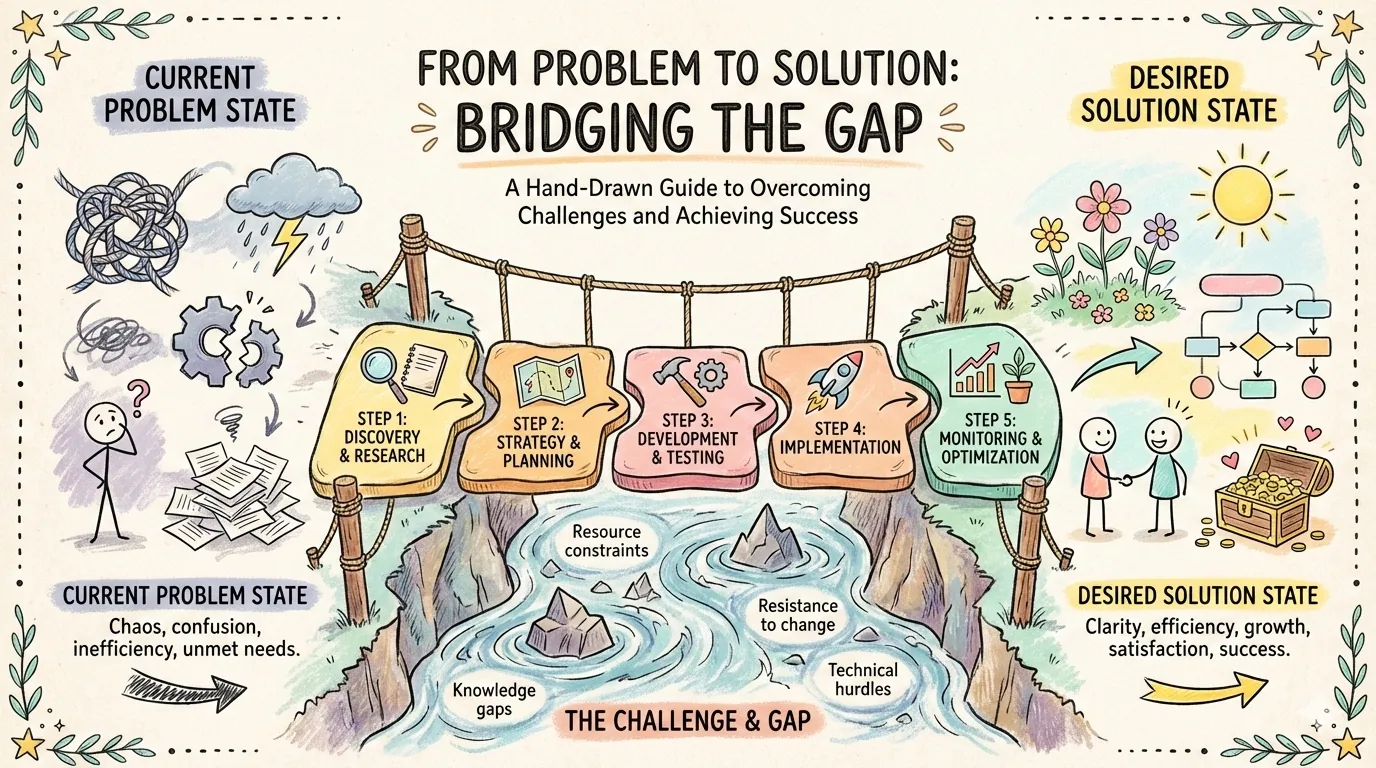
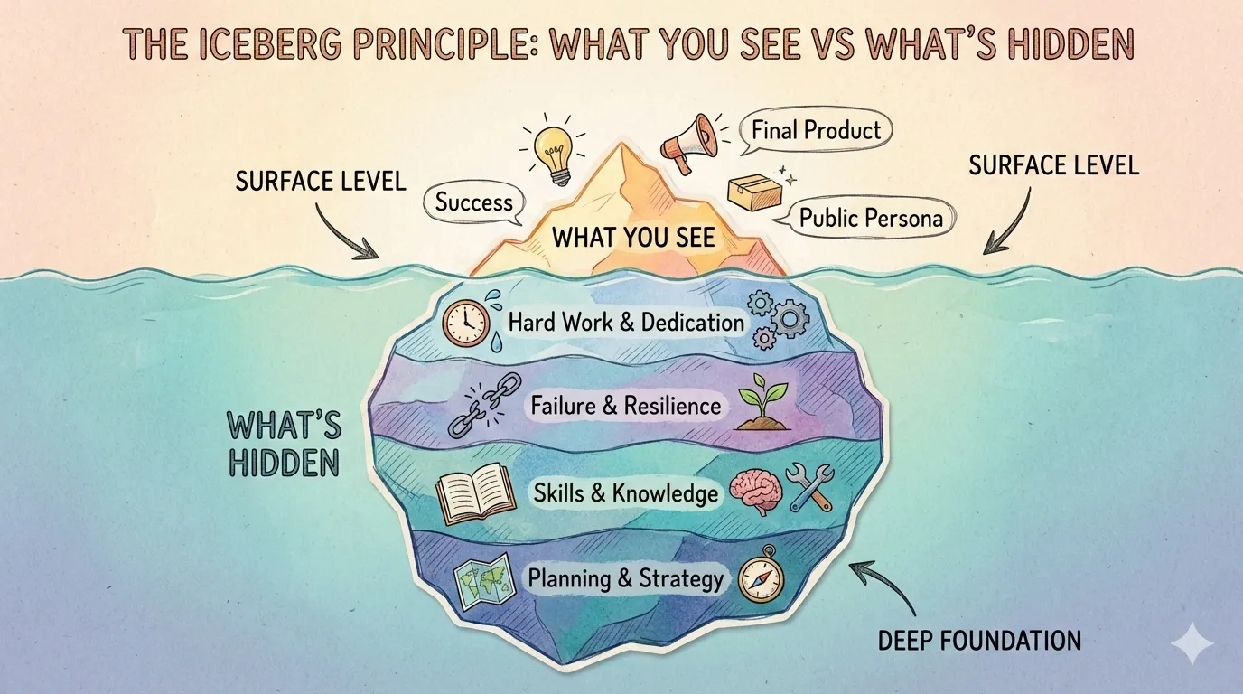
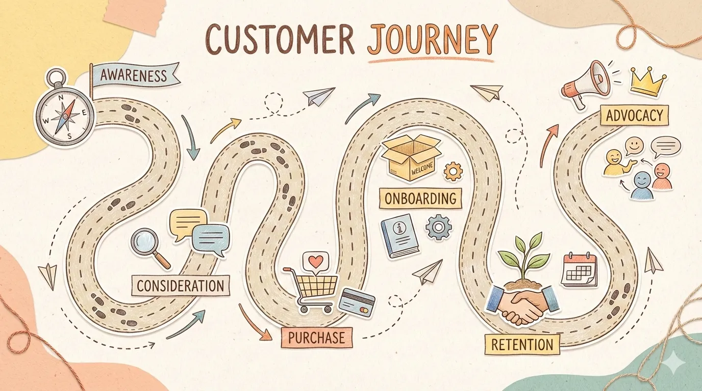
bridge fits problem → solution narratives. iceberg reveals surface vs. hidden layers. funnel visualizes filtering and conversion. pyramid is classic hierarchy. What you’re choosing isn’t just “does this look good” — it’s “does this structure fit my story.”
17 Styles: Giving Data Personality
![]()
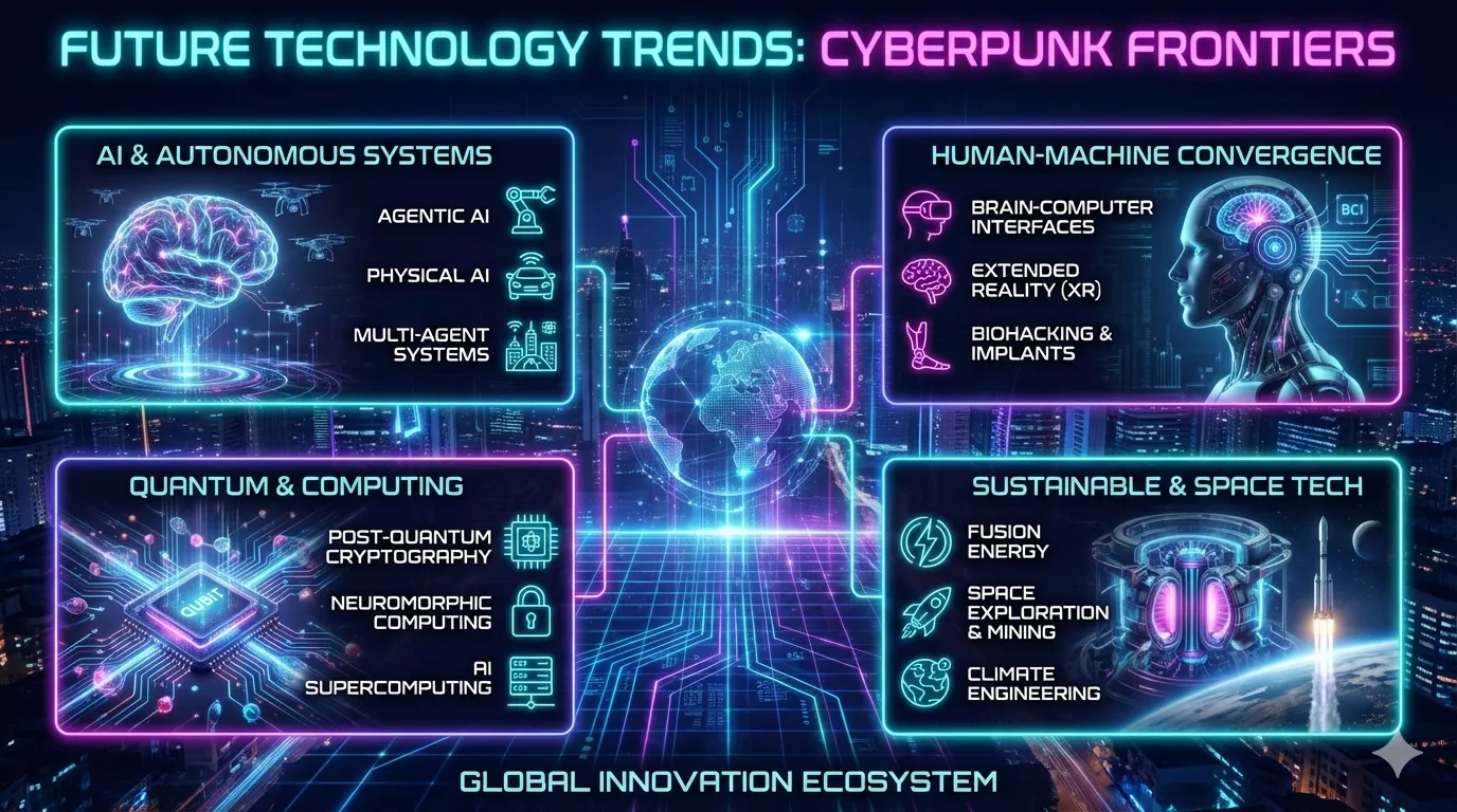
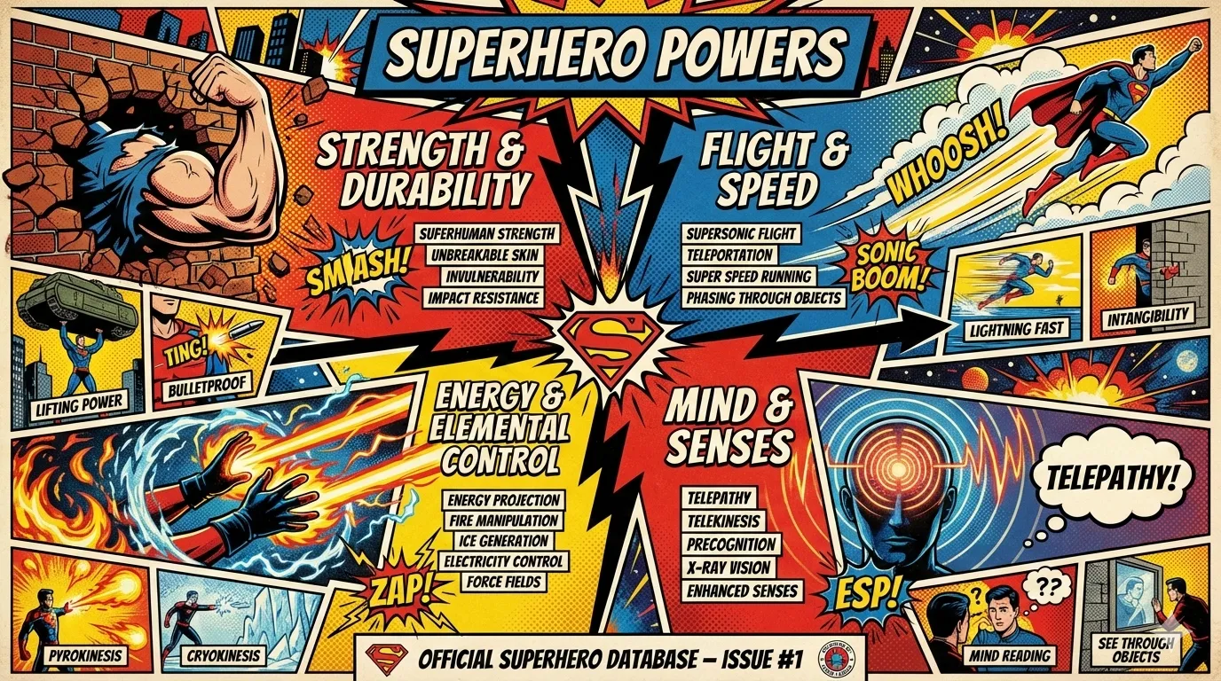
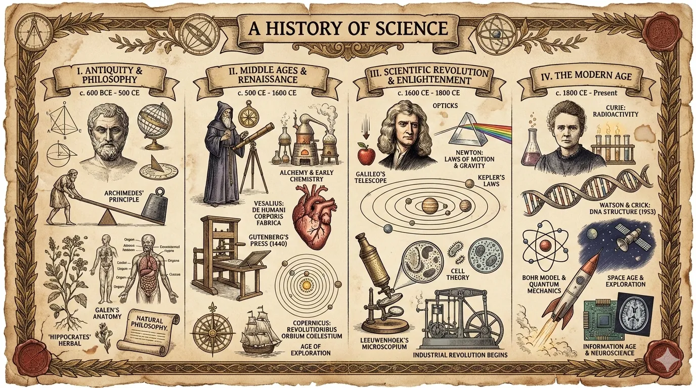
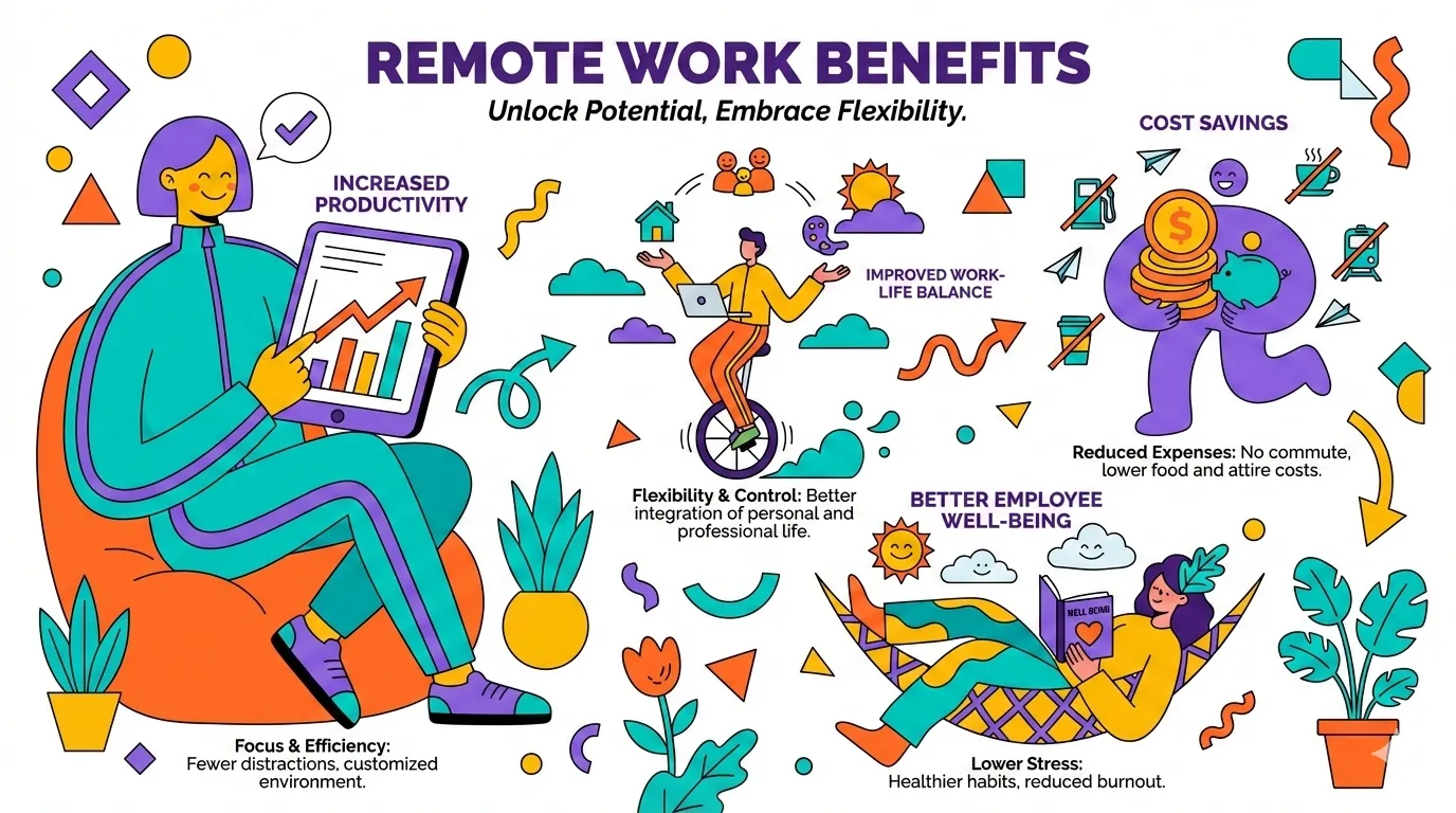
Same pyramid layout: craft-handmade gives you warm hand-drawn illustration. technical-schematic gives you cold blueprint precision. cyberpunk-neon gives you neon-lit futurism. Style determines the viewer’s emotional first impression; layout determines how they process the information.
20 × 17 = 340. For the vast majority of infographic needs, you never need to design from scratch.
Slide Decks: Multidimensional Combinatorics at Scale
baoyu-slide-deck pushes the style system to its extreme. Its visual style isn’t a single choice — it’s a combination of four orthogonal dimensions:
- Texture: clean / grid / organic / pixel / paper
- Mood: professional / warm / cool / vibrant / dark / neutral
- Typography: geometric / humanist / handwritten / editorial / technical
- Density: minimal / balanced / dense
4 × 6 × 5 × 3 = 360 possible parameter combinations. But instead of dumping this matrix on users, it ships 16 curated presets:
![]()
blueprint = grid + cool + technical + balanced — built for architecture diagrams. corporate = clean + professional + geometric + balanced — investor-ready. chalkboard = organic + warm + handwritten + balanced — teaching content. Each preset has an explicit dimensional recipe and a clear use case.
Once generated, all slides auto-merge into .pptx and .pdf — from generation to shareable output in a single step.
Comics and Covers: Visualizing Narrative
baoyu-comic and baoyu-cover-image go in a different direction — prioritizing narrative sense and emotional delivery over information density.
Comics: Art Style × Tone × Panel Layout
The comic skill supports 5 art styles, 7 tones, and 6 panel layouts:
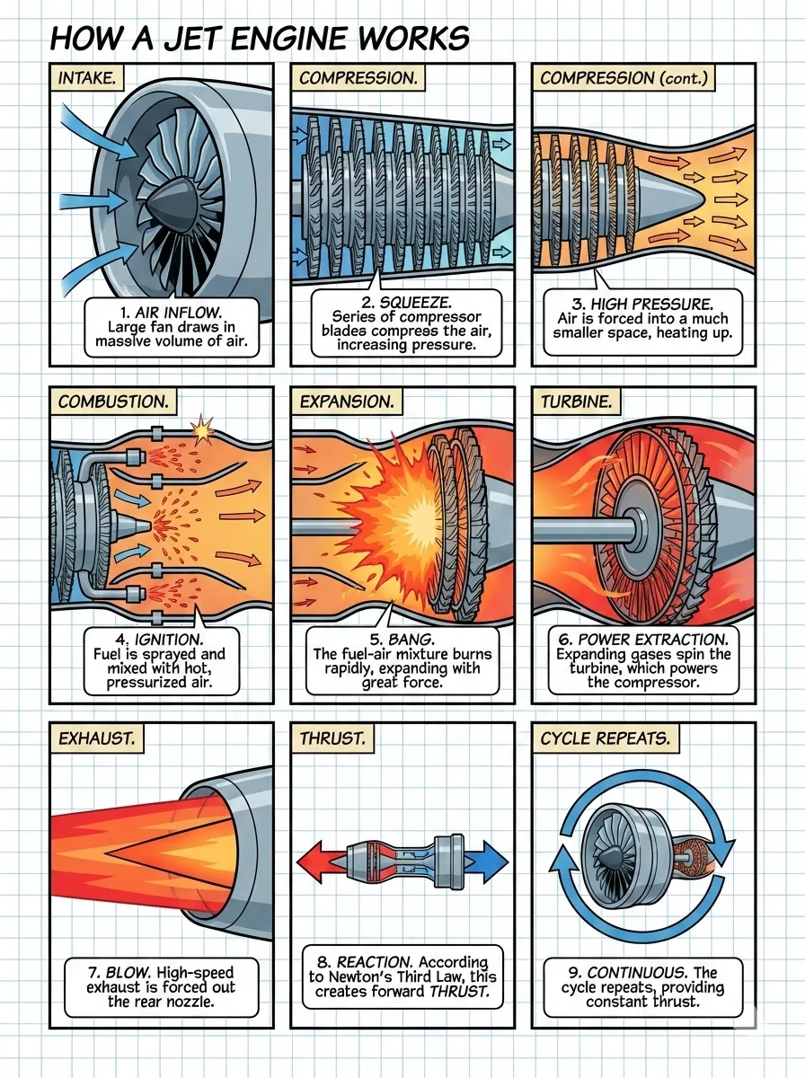
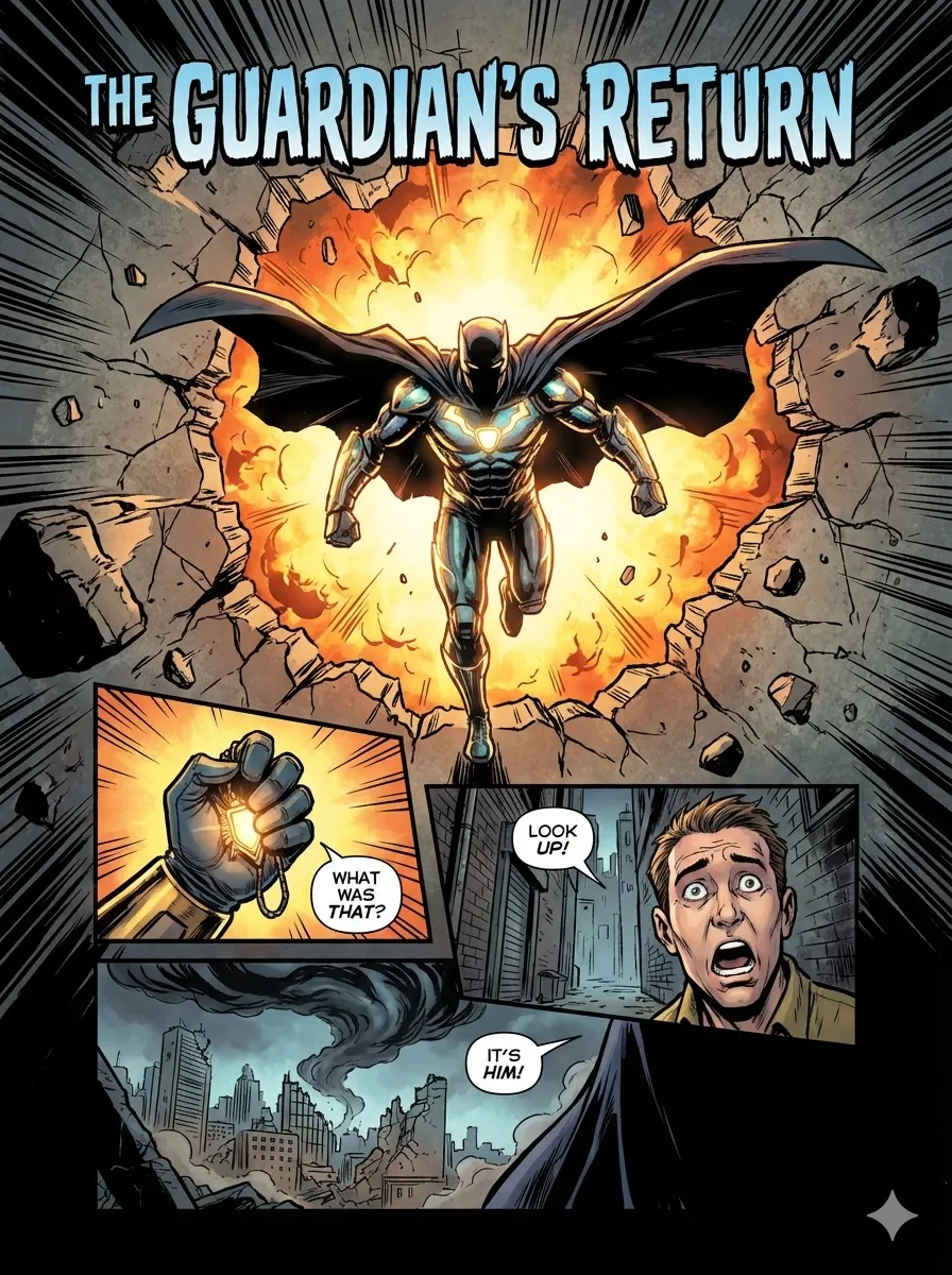
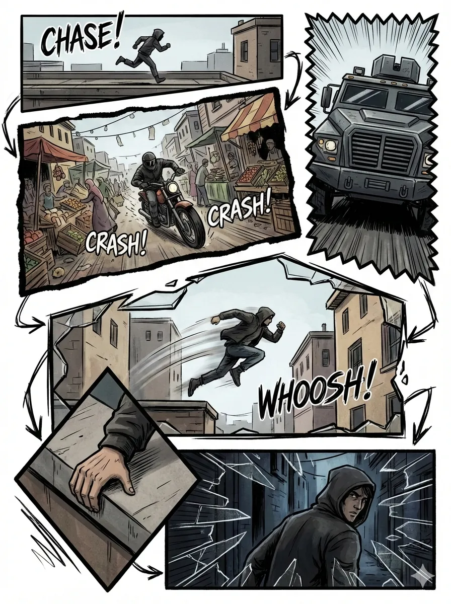
Art styles range from ligne-claire (European comic tradition) to manga, ink-brush (Chinese ink wash), and chalk. Combined with tone (warm / dramatic / romantic / energetic / vintage / action), the same story can be told in completely different visual languages.
Two presets deserve special mention. Ohmsha uses manga + neutral tone with special rules (“no talking heads, props reveal”) to produce distinctive technical-education comics. Wuxia uses ink-brush + action, adding qi energy effects and combat visuals — dressing technical stories in martial-arts aesthetics.
Cover Images: Five-Dimensional Customization
baoyu-cover-image combines type × palette × rendering × text × mood across five dimensions, offering 77 unique effects:
A cover is your article’s storefront. conceptual type + pastel palette + hand-drawn rendering + title-only text + subtle mood, versus hero type + dark palette + digital rendering + text-rich text + bold mood — two articles with entirely different personalities before a single word is read.
Why Parameterization Beats Prompt Engineering
At its core, baoyu-skills’ visual system makes one critical choice: sacrifice prompt freedom for parametric consistency and predictability.
What’s wrong with prompt engineering:
- Same prompt, different model — wildly different results
- Tweaking a prompt is blind tuning. Change one word, trigger cascading side effects you can’t predict
- No reusable components. The style from last week’s image can’t be “reused” on a new project
- When a prompt hits 200 words, you’re writing a design spec in natural language
What parametric systems get right:
- Input is structured: style + layout + optional palette
- Output is predictable: same parameters always produce the same visual tone
- Styles are reusable: a tuned combination transfers across projects
- Low learning curve: you don’t need design vocabulary — match preview images and pick
The value for content creators is clear: stop wasting decision energy on design. Save your cognitive resources for the content. Let parameters handle the visuals.
Install and Get Started
npx skills add jimliu/baoyu-skillsCore visual skill usage after install:
# XHS cards: auto-analyze article, recommend style + layout
/baoyu-xhs-images posts/my-article/article.md

# Specify style + layout + palette
/baoyu-xhs-images posts/my-article/article.md --style notion --layout dense --palette macaron

# Infographic: auto-recommend layout × style combination
/baoyu-infographic path/to/content.md

# Slide deck: generate with presets
/baoyu-slide-deck path/to/article.md --style corporate

# Comic
/baoyu-comic posts/turing-story/source.md --art manga --tone warm

# Cover image: five-dimensional customization
/baoyu-cover-image path/to/article.md --type conceptual --palette cool --rendering digital
No prompt writing. No design knowledge needed. Feed the article, pick parameters, get results.
Limitations and Warnings
Auto-recommendations aren’t always right. The skill analyzes content to suggest styles and layouts, but for specific brand tones or personal preferences, define your own presets via EXTEND.md.
Not all combinations look good. Among 700+ combinations, some are theoretically valid but visually incoherent. The preview feature lets you check before generating.
Image generation needs API keys. Skills like baoyu-infographic and baoyu-xhs-images require an image generation backend (OpenAI, Google, DashScope, etc.). Without API keys, your only option is the baoyu-danger-gemini-web workaround.
High-density layouts demand high-density content. dense layout fits 5-8 points, but if your source material doesn’t have that much structured information, forcing it in produces hollow cards.
Not for one-off use. If you only need an image once in a while, the learning curve for this system isn’t worth it. Use an online design tool instead. This is built for creators with sustained output — at least 3-5 pieces of content per week.
Final Word
The real bottleneck in AI-assisted design isn’t model capability. It’s design decisions. When you tell AI to “go wild,” the answer it gives you is the average of all possible answers — not bad, not good. Mediocre.
baoyu-skills’ approach is counterintuitive: it doesn’t give AI freedom, it gives AI constraints. Style, layout, palette — every dimension narrows the possibility space. But it’s precisely this narrowing that makes the output predictable, reusable, and distinctive.
This is the value of parametric design in the AI era: you don’t need to be a designer, but what you produce looks like a designer made it.
Next time you’re making visual content, don’t let the AI run free. Give it a style. Pick a layout. Then say “run.”
Sources: